• Home
  • Gallery
    • Fantastic Four
  • Blog
RYLAN KARJANE
  • Home
  • Gallery
    • Fantastic Four
  • Blog

Experience: Glass Blowing PARTnership

4/28/2021

0 Comments

 
Picture
Picture
For the past two weeks I have been going to a glass blowing class through a partnership between MLWGS and the glass blowing studio. It has been very fun and we have learned a lot about glass blowing. So far we have made two ornaments and a paper weight. I have included a picture of the ornaments I made two weeks ago to the top right. It was a really fun experience and very different from how I had imagined. It was a weird experience constantly rolling the pipe so that the glass would maintain a proper shape. Rolling the molten glass in the colors was also weird because the glass felt so malleable, I guess that is the point, but it was hard for me to truly conceptualize how fluid the glass would be until I experienced it myself as glass in my mind has always been synonymous with a hard fragile thing, rather than what we were dealing with. I loved that the giant furnace pictured below is called a 'glory hole.' I think the name is hilarious, especially in the context of what glory holes typically refer to.
I really liked the heat of the glory hole. I really like intense warmth for a short period of time(like hot showers) so I loved the part where we had to stand in front of the glory hole and turn the glass so that the colors could melt in and the shape to be cemented.
​Overall it was a really fun experience and I am excited to go again this friday and make some vessels!
Picture
0 Comments

At Home #2: Final

4/19/2021

0 Comments

 
I finished the piece and I am very happy with how it turned out. I was very apprehensive to finish it, which is why it took me so long to finish it, because I was nervous about painting the glass and having to color match the frame behind it and figure out how the glass would distort the image of what it behind it. Overall I am very happy with the glass. I turned out much better than expected and I think it looks pretty good, considering I forgot that this project was due until the day i was due, so I painting the wine glass in my first period class. I am still obsessed with the hand on the right, specifically the wrist and forearm. I just love the way I painted it and the colors I used to help give the allusion of depth. Overall I am very pleased with this piece :))
Picture
0 Comments

In Class #6: Process 1

4/16/2021

0 Comments

 
Picture
I am apprehensive about this piece. I really liked the composition and the original photo, but the drawing seems off; i don't really know how to describe it. But I think when i painted it i made the eyes too small or something like that. I think I am going to have to go in and change a bunch of the features and perhaps change the color scheme a bit because I think it might be too purple. Hopefully it will go well.
Picture
Picture
Picture
0 Comments

In Class #5: Process 3

3/26/2021

0 Comments

 
Picture
Picture
Picture
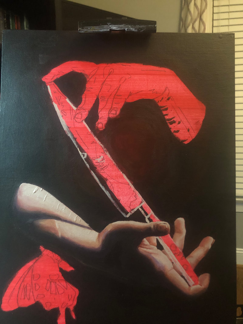
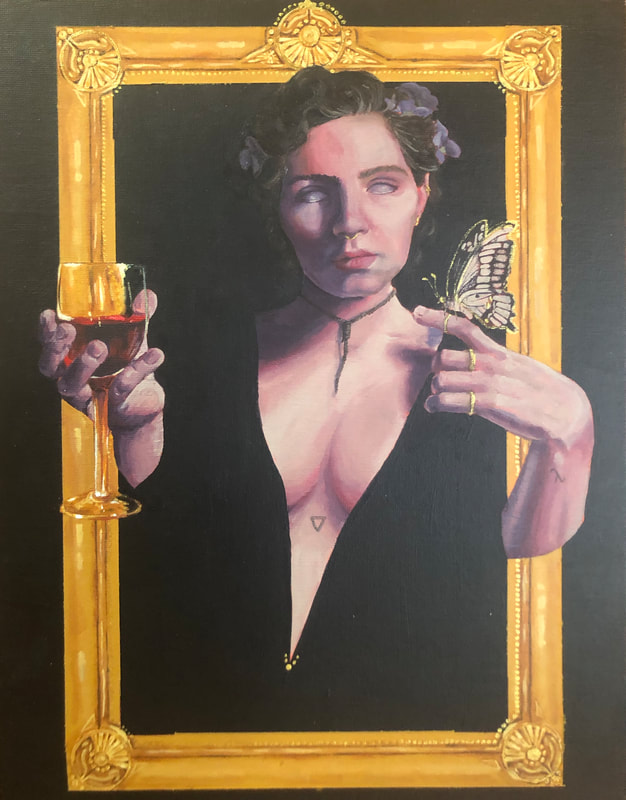
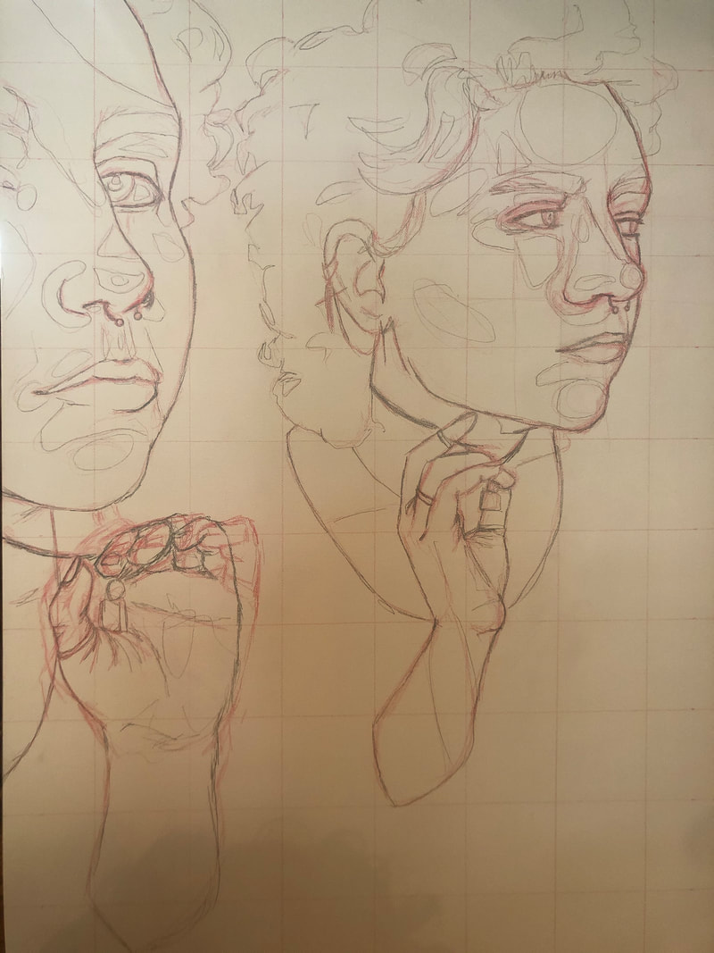
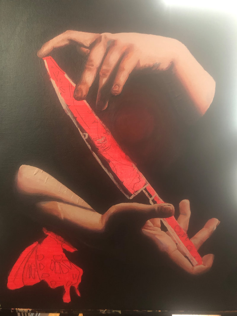
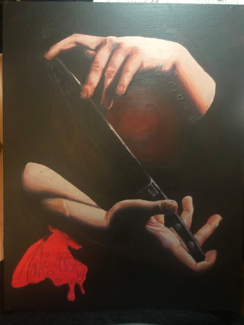
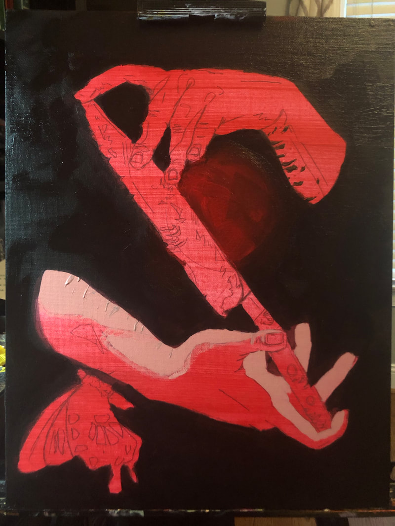
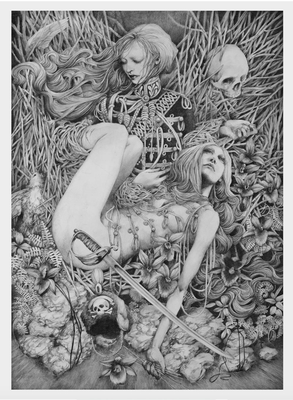
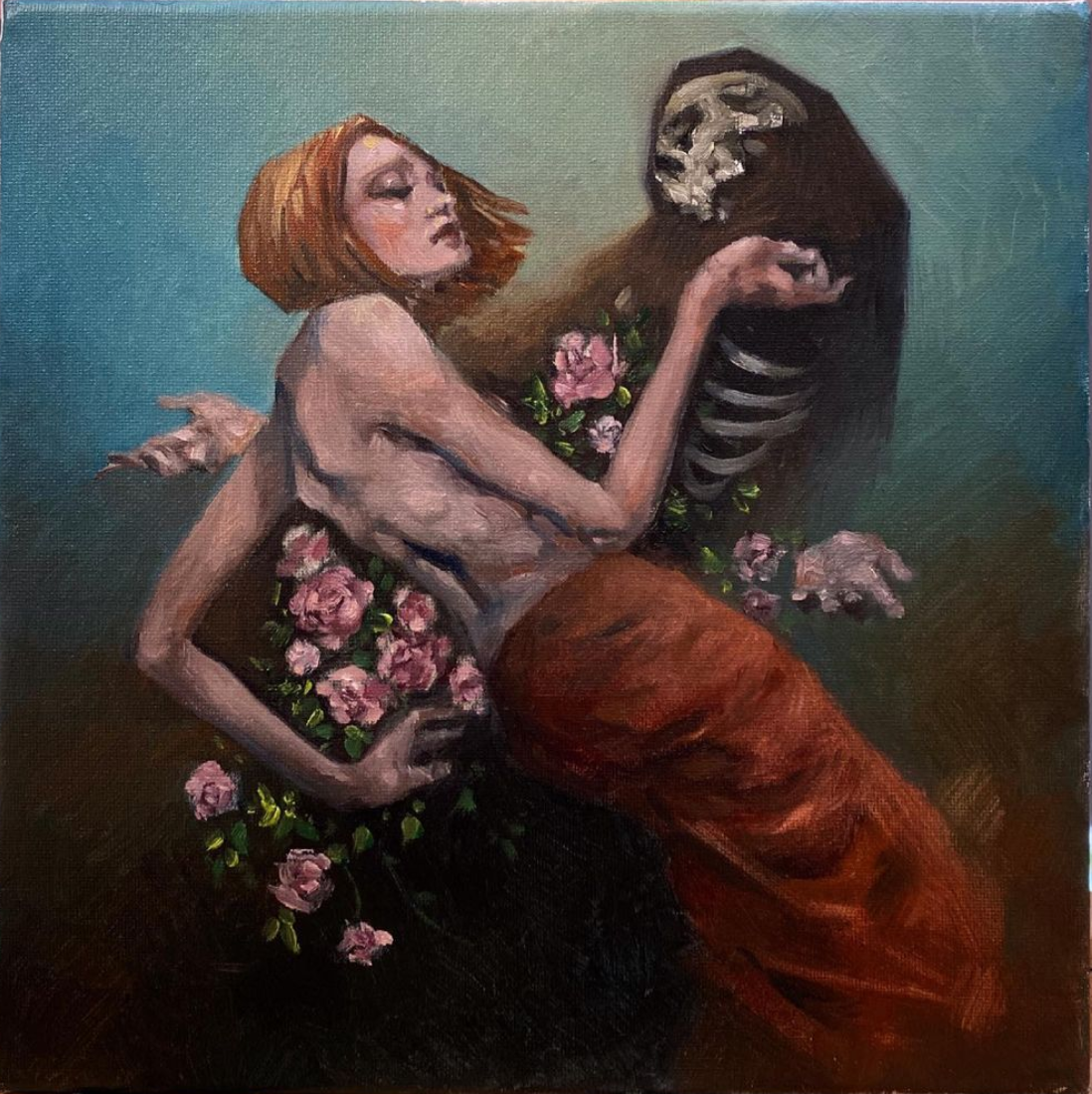
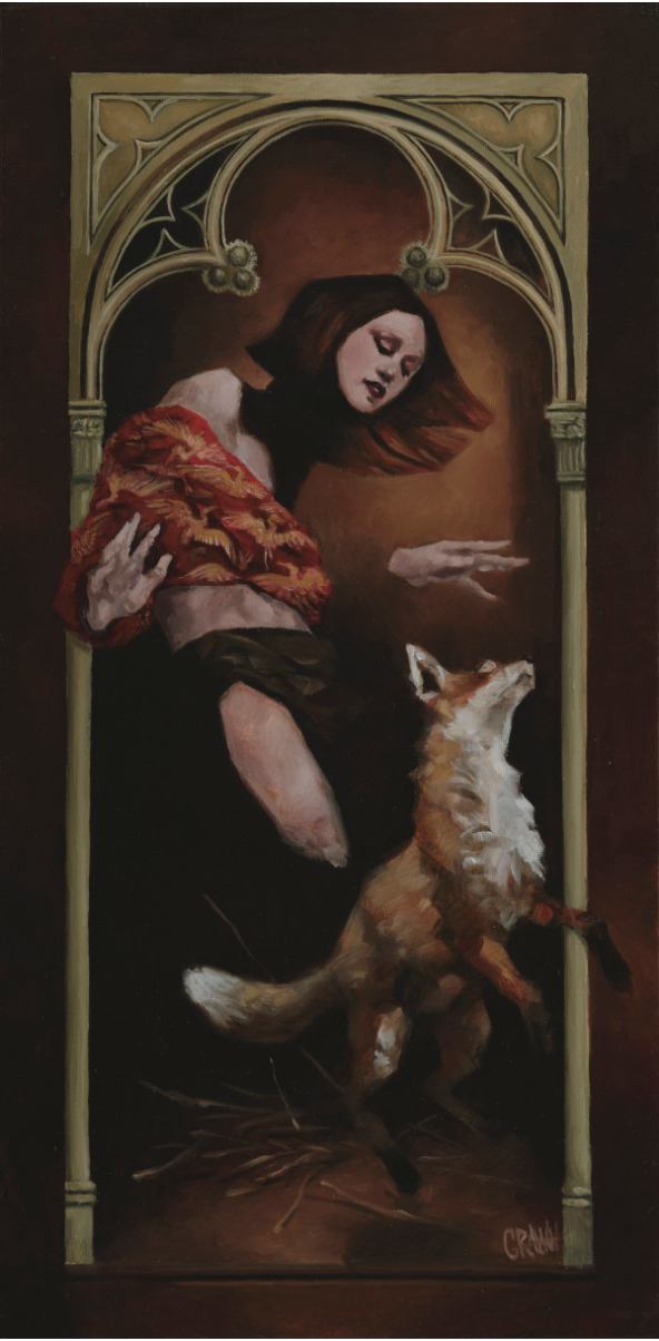
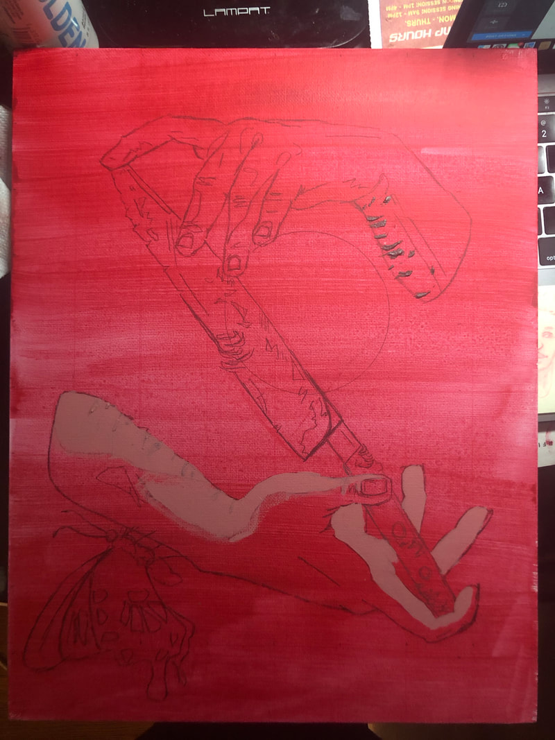
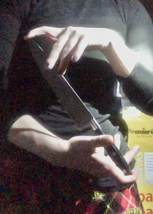
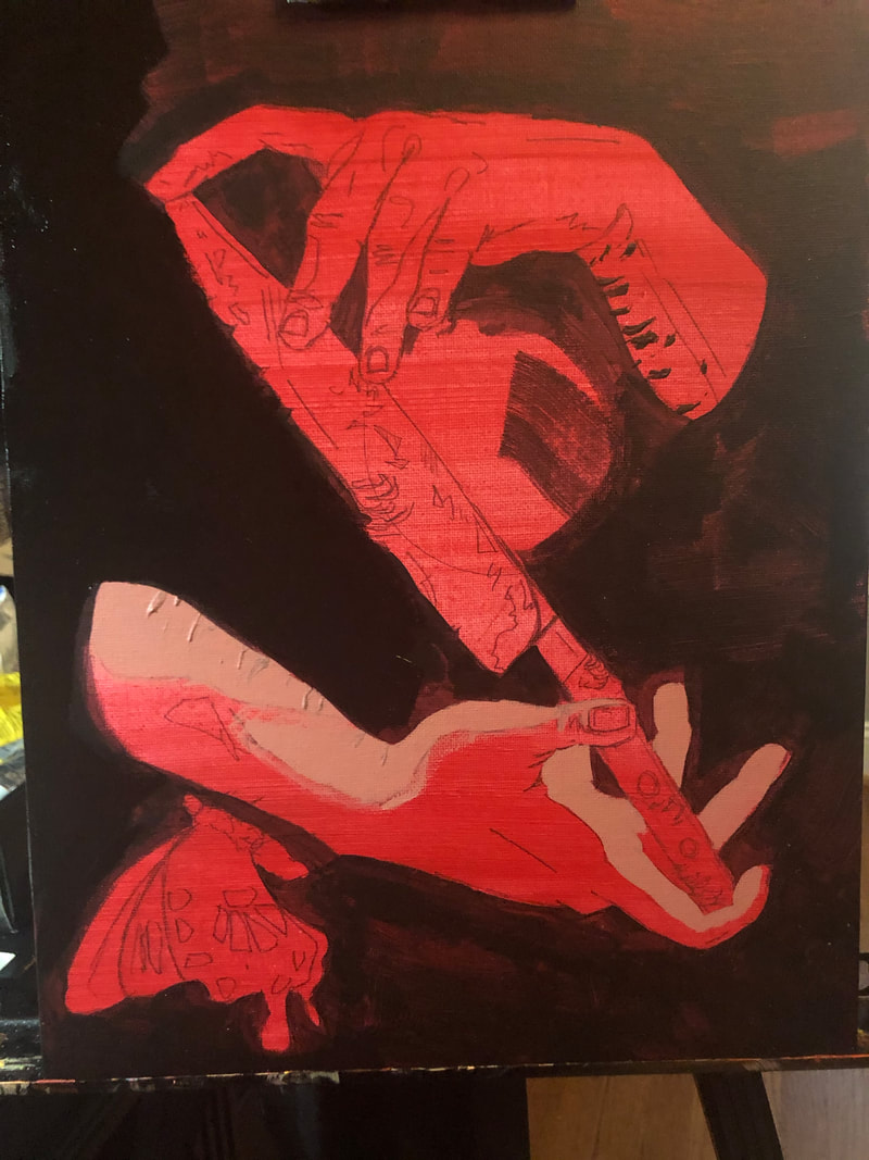
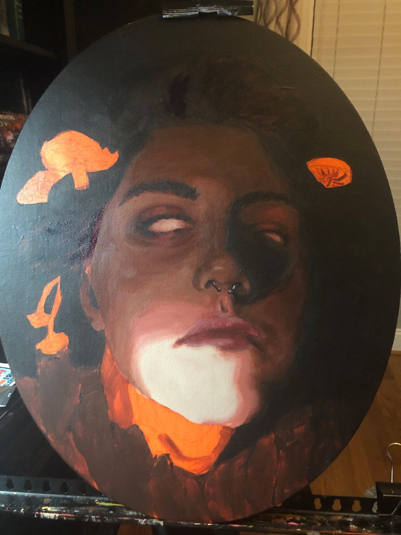
I finished the hands and the knife today! I am almost done. I just have to do the butterfly which shouldn't take that long, but it will be weird since it is bathed in shadow. I am very happy with how the knife turned out. I tried to do some rusty parts, but they didn't really turn out well so I just glazed over them with some black and it turned out fine. I especially love the handel and all of the highlight bits. You don't really see any in the actual blade itself because it is turned against the light, but I still looks cool. The top hand looks a bit off. I don't think the blending is as good as it can be, and the fingers look a bit off(I think they might be a bit chunky looking, but that is in part because of the kind of awkward angle(especially the pinkie finger.) Regardless, I am happy with how it is turning out and I am excited to finish it this weekend.
0 Comments

In Class #5: Process 2

3/19/2021

0 Comments

 
This week I got more into my painting. I basically finished the background, as it is just black with a slight red circle  in the middle. I realized how wacky/bended the knife was, so I got a ruler out to straighten it and change the shape a bit so that it didn't look so weird. I also finished the bottom hand i think. I am very happy with how it has turned out. I think the colors look cool and the blending is oK(it could be better, but I ran out of some of the midtones towards the end and I am too lazy to make some more right now. I am excited to start working on the hand and finish the piece. I love the direction it is headed
Picture
Picture
Picture
0 Comments

Awareness: Craww

3/15/2021

1 Comment

 
Picture
Ghost, 2018, oil paint on stretched canvas, 800mm x400mm

Basic info:

Born Shaun Friend, Craww is a british artist whose work deals with "the beauty to be found in contradictions and ambiguity - life and death, beauty and decay, strength, fragility, the interplay between conflicting and complementing forces of nature." He started his career path as a passionate graphic designer in advertising agencies, but in his mid forties he shifted his focus onto art,  developing the alias Craww, and became an amazing artist. For the Past decade, Craww has had a successful art career. He has had many shows all over the world, including a solo show at the Nero Gallery in Rome called "Ebb and Flow" in March 2017, and two solo shows at Haven Gallery in New York the first called “Swords” in December 2018 and the second called "Woven" in January 2021, and countless other group and joint shows.
Picture
Navigator,  2020, oil on stretched canvas, 70cm x 70cm
Picture
Sacred Practices, 2018, graphite pencil on Fabriano paper, 760mm x 560mm
Picture
Trinity, 2017, graphite pencil on Fabriano paper, 560mm x 400mm
Picture
Vessel, 2016, graphite pencil on Fabriano paper, 760mm x 560mm

My Views:

I really love Craww's paintings. The emotion and the whole vibe of the pieces are amazing. I love his craftsmanship and brushwork, especially in the way he paints skin. I love the subtle hint of mystery and creepiness in his paintings. I am really drawn to his compositions, like those of the long, skinny paintings he makes and the drawings and paintings so packed to the brim with detail that you don't know where to look.​

​His conglomeration is so thoughtful and after following him on Instagram for a few months, where I initially encountered his work, I have begun to understand his process of creation and planning better. He constantly doodles and is out biking and hiking in nature, which is primarily where he seems to draw his ideas from, whether the nature is incorporated in the landscape backgrounds or flowers, or animals scattered across his paintings. I love how he approaches his background, giving them enough variety between pieces, but still maintaining a general cohesiveness. In his more plain backgrounds, he achieves interest by having highlights of warmer, lighter color around or near the heads of his subjects. His paintings really inspired me for my at-home painting and my most recent in-class painting. His incorporation of disembodied body parts in his paintings like Navigator, No Quarter, and Communion(all shown in this post) was a real driver in experimenting with elements of that within my own work. Furthermore, he is really skilled in his fade to black mechanisms(i didn't really include his paintings that do this other than No Quarter) which is nice for me to look into, especially when he posts short painting clips on instagram, as I am working on my tenebrism, which involves a lot of fade to black in my work.

I think No Quarter is one of my favorite paintings of his, even though it is so different from most of his other and more recent work. The simplicity, the drama, the coloring, the lace, the red string!! I love all of it so much. I also love really love the general coloring that he uses in his paintings that seems to have a generally universal vibe even though the color palettes can be so different. I think this is because of his blue-black underpaintings that he does to work out the correct values and shapes before he goes in with the actual color. 

He starts his paintings by sketching out a few possible ideas in his sketchbook, playing with composition subject elements, then he sketches his final idea onto his canvas, using a grid technique to ensure his proportions are what he had initially planned. He then goes in with the color in glazes and other applications. Sometimes, if he is unhappy with the way a painting turned out, or thinks that it could have gone in a different better direction, he will repaint it. He paints each section part by part, so focusing on finishing, or almost finishing a helmet at one time and then moving on to say the flowers, or the figure or whatever, but he paints in chunks, rather than attacks the painting as a whole. I might have to try out the concept of underpaintings now, because of how much I love his artwork, I would probably do red because I love red and how it brings warmth to the painting.
​

I also had a really hard time choosing the paintings of his I wanted to include in this post because I love so much of his artwork, so just know that he has countless other paintings and drawings that are equally as stunning as these! 
Picture
Space Between, 2018, oil paint on stretched canvas, 800mm x400mm
Picture
A little 200mm x 200mm wip I found on his instagram, that I am in love with!
Picture
I could not find any credit info for this one as I think he reworked it many times and has no intention of selling it.
Picture
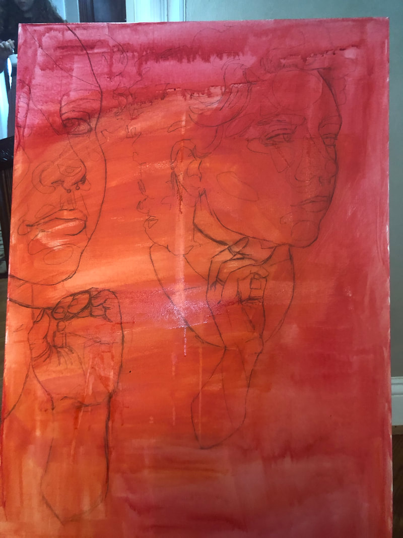
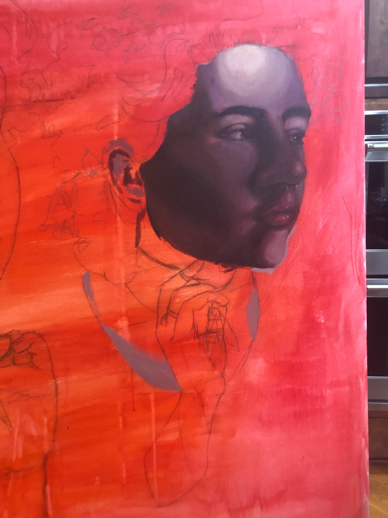
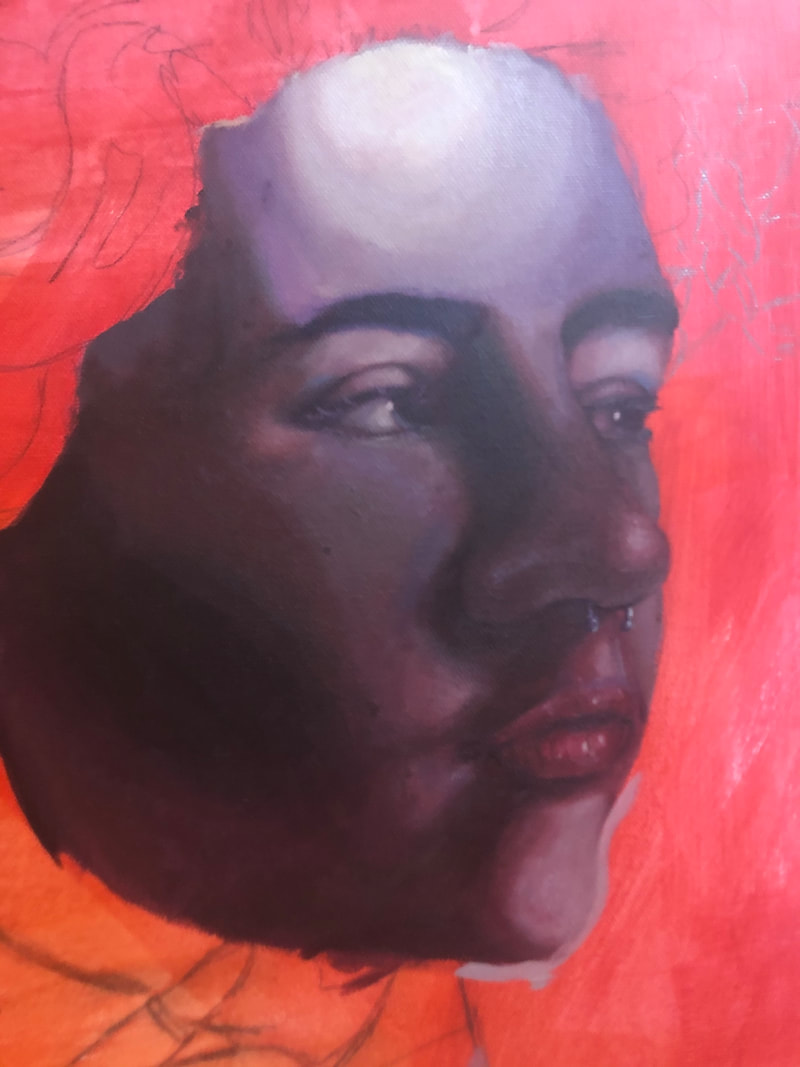
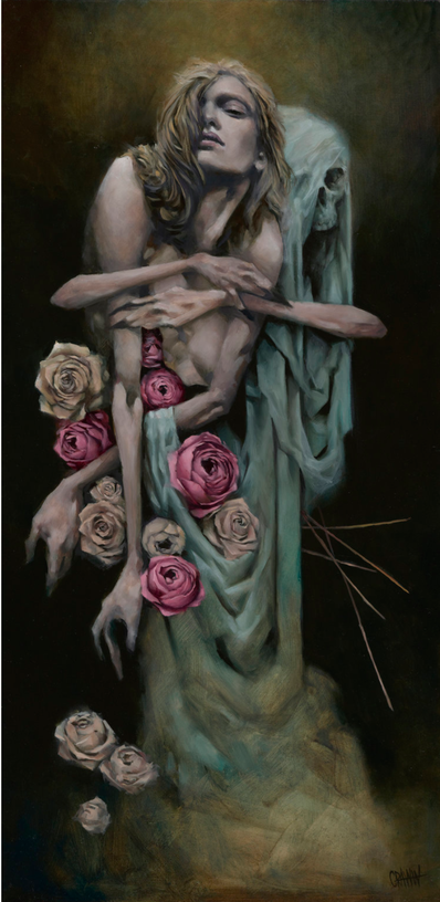
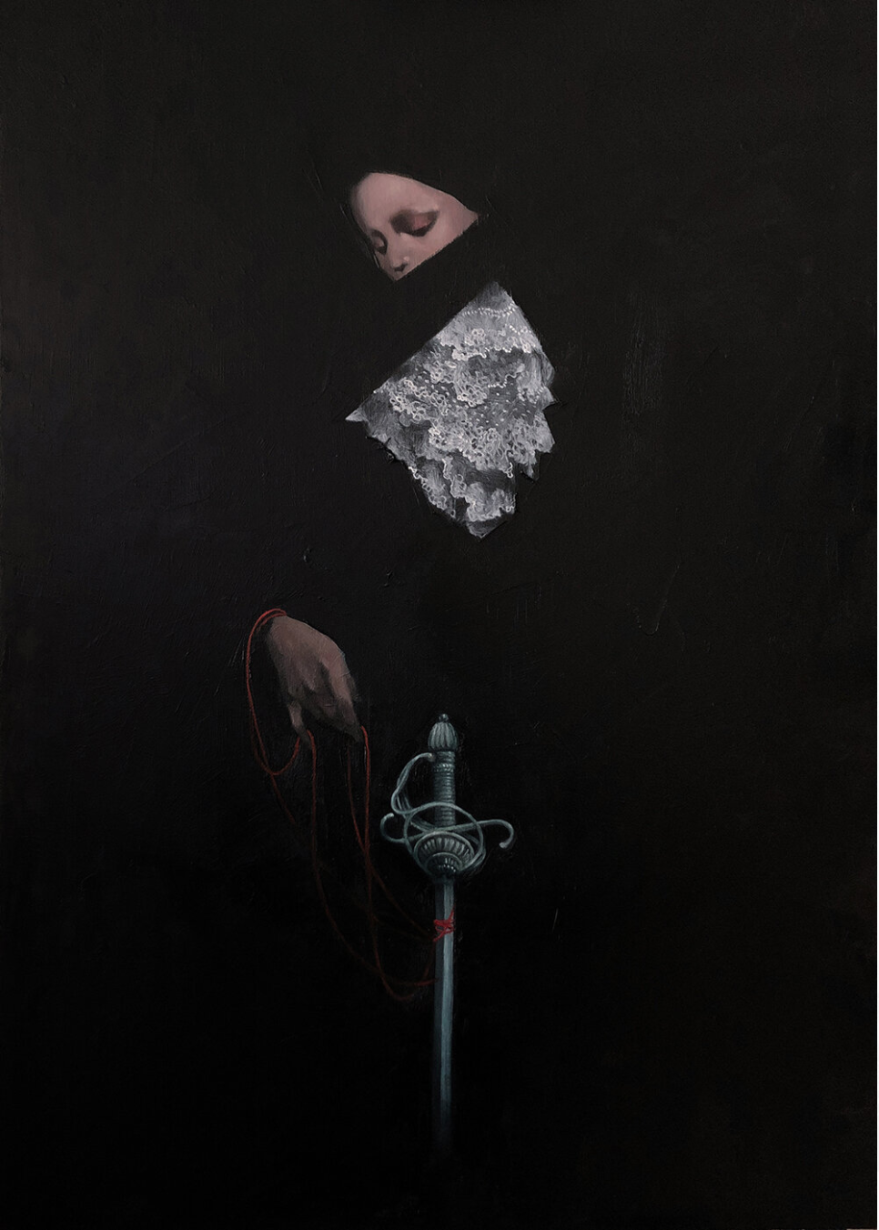
No Quarter, 2019, oil and cold wax medium on linen, 700mm x 500mm
Picture
Familiar ghosts, 2020, oil on stretched canvas, 700mm x 700mm
Picture
Arboreal Echos, 2020, oil on canvas, 80x100cm

More Information:

Interview with Craww:
beautifulbizarre.net/2016/02/16/interview-oc-vs-craww-a-special-edition-of-open-call/
​

Podcast Episode ft Craww called "Love is Like Pork":
www.youtube.com/watch?v=cTmOwutM_60
​

​His Haven Gallery show "Woven":
www.havenartgallery.com/portfolio/craww-woven/

More Artwork:

Website: www.craww.com/
* not recently updated and doesn't have all of his work

Shop: craww.bigcartel.com/
​

Instagram: www.instagram.com/craww/
    Instagram is probably the best place to see all of his work as well as his process, inducing wips and doodles

Facebook: www.facebook.com/Craww.Art/
Picture
Communion, 2020, oil on stretched canvas, 40cm x 20cm
Picture
Elegy, 2020, oil on stretched canvas, 40cm x 20cm
Picture
Realm, 2020, oil on stretched canvas, 40cm x 20cm
1 Comment

Experience: Japanese Aesthetics Lecture

3/12/2021

0 Comments

 
Picture
A wood block print i found online that illustrates some examples of japanese aesthetics as well as architecture
Picture
Example of Wabi-Sabi
On March 11th, 2021 , MLWGS hosted a lecture by Amanda Dalla VIlla Adams over Zoom discussing Japanese Aesthetics. I think I had gone to a similar lecture in 2018 or 2017. I can't really remember, but I was excited to watch it because from what I remembered of Japanese Aesthetics from previous knowledge and discussions of it over the years, it is a pretty interesting topic that I could stand to learn a lot more about.

​I was especially interested in the concepts surrounding western beauty, Immanuel Kant's Critique of Judgement, where he attempts to quantity beauty in an objective sense, and how it contrasts from Japanese Aesthetics. Kant basically came to the conclusion that in order to find something beautiful, we can't have any use for it. If we are using it for something, it clouds are true view of it, warping its beauty by its use. I think it is a bit more complex than that as you can really have a use for everything. If you own something, then you have a use for it, regardless of how irrelevant or inconsequential. For example, owning artwork; its use is to look pretty. By that logic it cannot be beautiful, nothing really can be beautiful as everything has a use. Furthermore, Kant's claims would qualify no person as beautiful, which I disagree with. Japanese Aesthetics, in turn, was founded on the ideas circulating the Han Court(794-1185), or what is considered the height of all Japanese Aesthetics. The Tale of Genji gives us the three pillars of Japanese aesthetics: wabi, transient and stark beauty, sabi, the beauty of natural patina and aging, and yūgen, profound grace and subtlety. These pillars describe beauty in a much more natural and simplistic way, releasing it from the human consumption, comprising Western Aesthetics as defined by Kant.

I find that I am plagued by the constructs of the Western idea of beauty because I want to make beautiful things. We once had a discussion about this last year and the fine line between beauty and ugliness, or really the lack of the line in some instances, and this lecture really brought that into my mind to ponder about, and perhaps take some risks and maybe incorporate more ugliness into my work. I also was reminded about the fixing bowls with gold and I really want to do something with that in the future because I love that concept.
Picture
0 Comments

Process In Class 5: #1

3/12/2021

0 Comments

 
Picture
Picture
I started my painting this week. I took reference pictures for my painting and sketched out the drawing and started on the painting. I am happy with how this is turning out. I am nervous about how the knife is going to work out, because I am not used to painting metal, let alone rust and things like that. I think i am going to bump the contrast of the painting, to make the darks of the hands/arms darker so that they blend in with the background, which will be black, more.
Picture
0 Comments

In Class #4: Process 4

2/25/2021

0 Comments

 
I finished my painting and I am very happy with how it turned out. Although it could be a bit cleaner in some places and a little better executed, i am really happy with the drama of the lighting and the mood of the piece. the mushrooms and the bark turned out even better than I thought they would, even though you can't really see the detail in the bark that well from the picture. I was very nervous for how the eye on the right would turn out because there was such a big shadow over part of it, but I am really happy with it. I think how i went about it was pretty good. I am also happy with how the hair turned out in the shadows where it really isn't in the light. Overall I am happy with this piece!
Picture
0 Comments

In Class #4: Process 3

2/19/2021

0 Comments

 
Picture
Picture
Picture
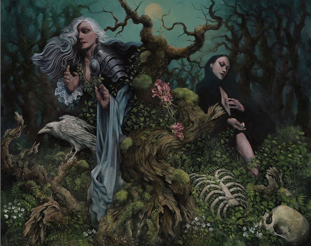
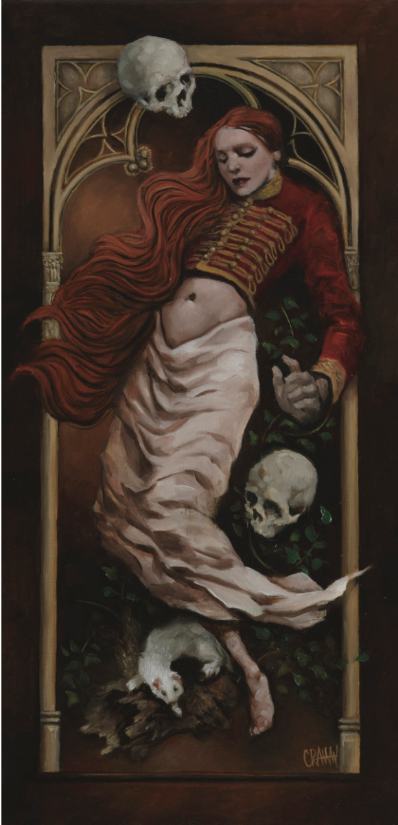
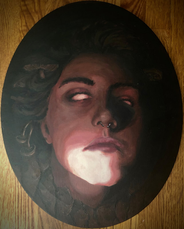
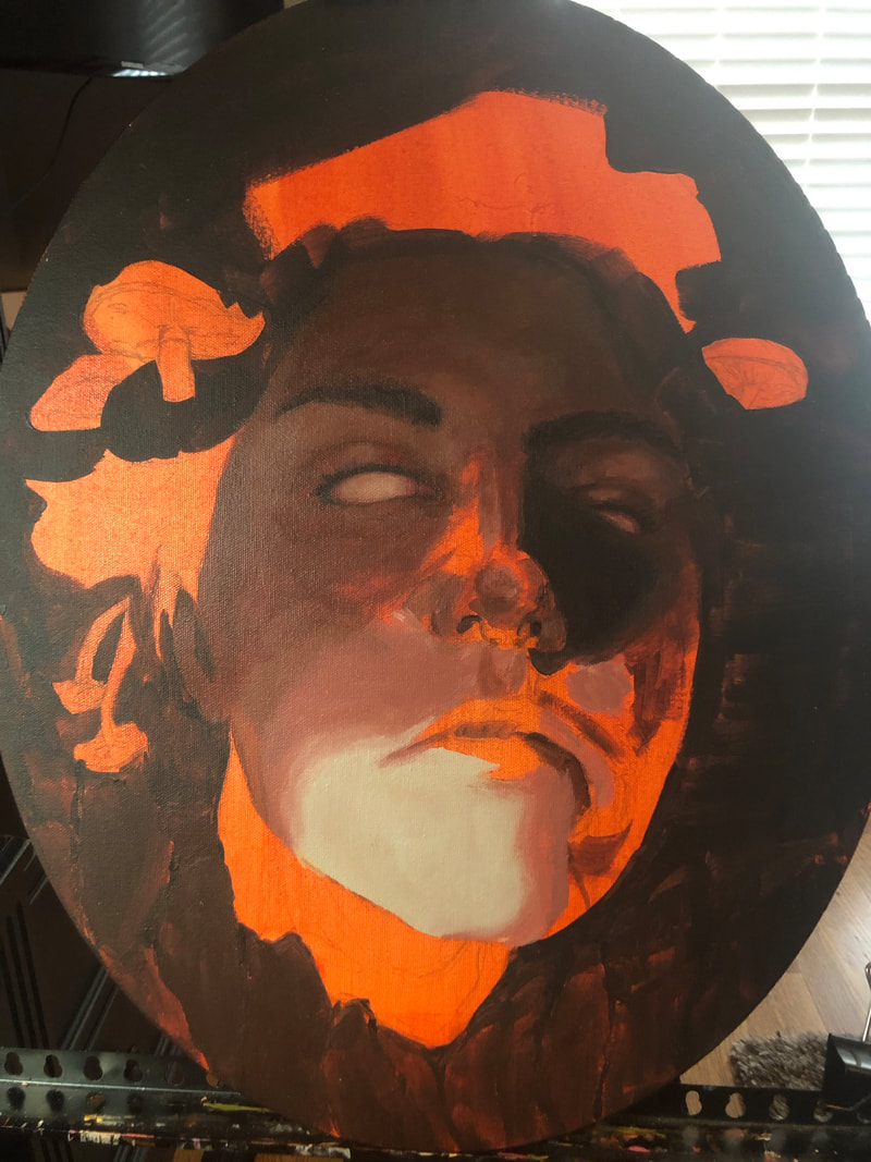
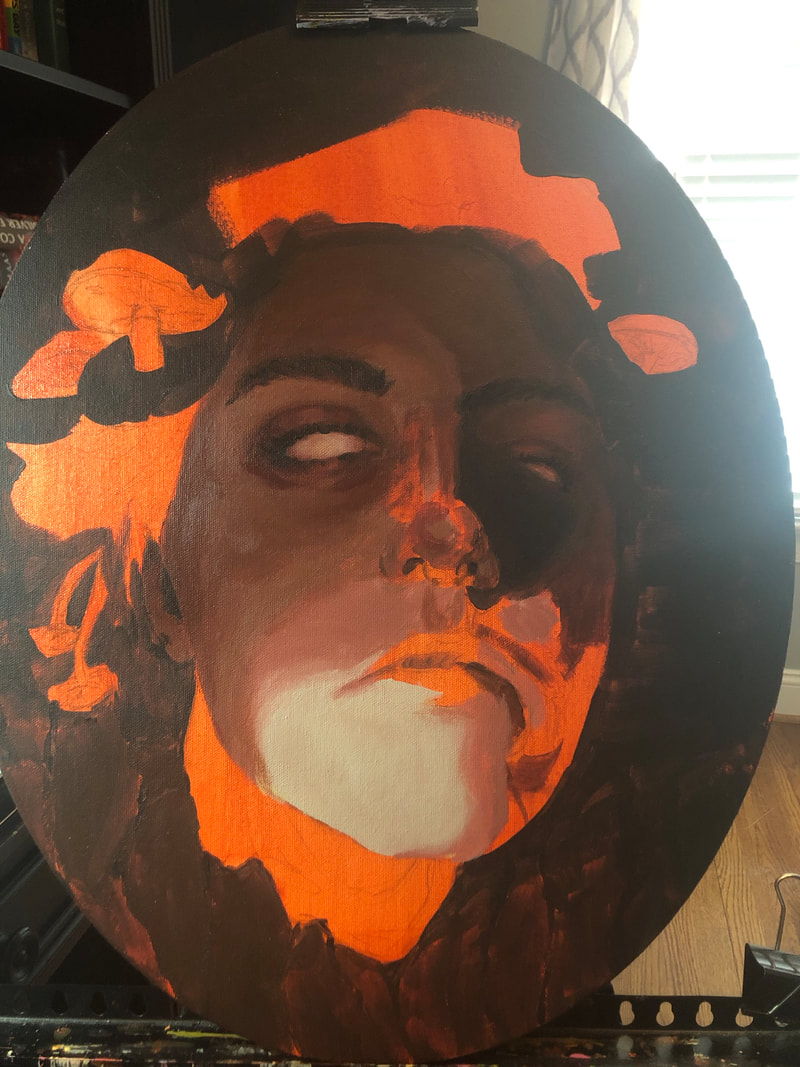
I finished the face, i think. I am happy with how it is looking. I might fix up a few things when i go in again on monday. It has been fun working on this :)
0 Comments
<<Previous

    Author

    I am a sleep deprived artist trying to make ends meet. :)

    Categories

    All
    Awareness
    Experience
    Process

    Archives

    April 2021
    March 2021
    February 2021
    January 2021
    December 2020
    November 2020
    October 2020
    September 2020
    August 2020
    July 2020
    June 2020
    May 2020
    April 2020
    March 2020
    February 2020
    January 2020
    December 2019
    November 2019
    October 2019
    August 2019
    July 2019
    June 2019
    May 2019
    April 2019
    March 2019
    February 2019
    January 2019
    December 2018
    November 2018
    October 2018

    RSS Feed

Powered by Create your own unique website with customizable templates.
  • Home
  • Gallery
    • Fantastic Four
  • Blog