• Home
  • Gallery
    • Fantastic Four
  • Blog
RYLAN KARJANE
  • Home
  • Gallery
    • Fantastic Four
  • Blog

Experience: Glass Blowing PARTnership

4/28/2021

0 Comments

 
Picture
Picture
For the past two weeks I have been going to a glass blowing class through a partnership between MLWGS and the glass blowing studio. It has been very fun and we have learned a lot about glass blowing. So far we have made two ornaments and a paper weight. I have included a picture of the ornaments I made two weeks ago to the top right. It was a really fun experience and very different from how I had imagined. It was a weird experience constantly rolling the pipe so that the glass would maintain a proper shape. Rolling the molten glass in the colors was also weird because the glass felt so malleable, I guess that is the point, but it was hard for me to truly conceptualize how fluid the glass would be until I experienced it myself as glass in my mind has always been synonymous with a hard fragile thing, rather than what we were dealing with. I loved that the giant furnace pictured below is called a 'glory hole.' I think the name is hilarious, especially in the context of what glory holes typically refer to.
I really liked the heat of the glory hole. I really like intense warmth for a short period of time(like hot showers) so I loved the part where we had to stand in front of the glory hole and turn the glass so that the colors could melt in and the shape to be cemented.
​Overall it was a really fun experience and I am excited to go again this friday and make some vessels!
Picture
0 Comments

Experience: Japanese Aesthetics Lecture

3/12/2021

0 Comments

 
Picture
A wood block print i found online that illustrates some examples of japanese aesthetics as well as architecture
Picture
Example of Wabi-Sabi
On March 11th, 2021 , MLWGS hosted a lecture by Amanda Dalla VIlla Adams over Zoom discussing Japanese Aesthetics. I think I had gone to a similar lecture in 2018 or 2017. I can't really remember, but I was excited to watch it because from what I remembered of Japanese Aesthetics from previous knowledge and discussions of it over the years, it is a pretty interesting topic that I could stand to learn a lot more about.

​I was especially interested in the concepts surrounding western beauty, Immanuel Kant's Critique of Judgement, where he attempts to quantity beauty in an objective sense, and how it contrasts from Japanese Aesthetics. Kant basically came to the conclusion that in order to find something beautiful, we can't have any use for it. If we are using it for something, it clouds are true view of it, warping its beauty by its use. I think it is a bit more complex than that as you can really have a use for everything. If you own something, then you have a use for it, regardless of how irrelevant or inconsequential. For example, owning artwork; its use is to look pretty. By that logic it cannot be beautiful, nothing really can be beautiful as everything has a use. Furthermore, Kant's claims would qualify no person as beautiful, which I disagree with. Japanese Aesthetics, in turn, was founded on the ideas circulating the Han Court(794-1185), or what is considered the height of all Japanese Aesthetics. The Tale of Genji gives us the three pillars of Japanese aesthetics: wabi, transient and stark beauty, sabi, the beauty of natural patina and aging, and yūgen, profound grace and subtlety. These pillars describe beauty in a much more natural and simplistic way, releasing it from the human consumption, comprising Western Aesthetics as defined by Kant.

I find that I am plagued by the constructs of the Western idea of beauty because I want to make beautiful things. We once had a discussion about this last year and the fine line between beauty and ugliness, or really the lack of the line in some instances, and this lecture really brought that into my mind to ponder about, and perhaps take some risks and maybe incorporate more ugliness into my work. I also was reminded about the fixing bowls with gold and I really want to do something with that in the future because I love that concept.
Picture
0 Comments

Experience: Nils Westergard Art Talk

1/25/2021

0 Comments

 
Picture
Girl with phone,​ Richmond, VA, 2016
Picture
^^Example of his detailed stencil work
Waterwings, 24x44”, aerosol on aluminum, 2020
Picture
​Waynesboro, VA, 2019
Link to the Video: www.youtube.com/watch?v=VC4u P5OZSpQ
Link to his website: www.nilswestergard.com/
Link to his Instagram: www.instagram.com/nil srva/

 I watched Marina's RVA Art Talk Video where she interviewed artist Nils Westergard.
Painting runs in his family, but he didn't really get into art until when he was in school and got into graffiti. But before that he started art in stage production, where he would paint these huge walls; however, he didn't associate it with art until much late.
  Now he is getting a lot more commissions, including in Europe, so he gets to travel around Europe painting. He is especially fond of Amsterdam and he even speaks Dutch and has a Belgian passport so he is able to travel around Europe easily. He considers Amsterdam his second home, however it is a hard city to paint in because the whole city is a monument. Although he likes living in richmond because it is affordable for an artist and is accessible to other areas to have shows and paint, the vibe of richmond is too conservative for him. When he approaches people to paint on their walls, they think allowing them to paint on wall is a gift from them, when really Westergard is giving them a free painting on the wall. It is a gift to them, but they are very snotty about it.
   Westergard loves working really big like in his Waynesboro painting(see bottom left), but it is also really expensive, as that much paint and a lift is costly, so doesn't get to do much. In fact, Westergard mostly does his walls murals for free, gets paid with flights to the places, food, materials (he usually works in black and white because it is much cheaper), and sometimes housing, etc. However, he still has commissions.
  Westergard doesn't feel as though he is a muralist. He identifies with his much less known studio work, his stenciling(second down on the left). It, even though much smaller, takes longer is more intricate than his wall paintings. Surprisingly he actually draws very little, even though his realism is so good, and sees himself as a human printer for the photos he takes.
    I really enjoyed this artist talk and i loved learning about a new artist that lives near me. I have seen some of his work before while driving around richmond and always marveled at how beautiful it was. I am glad to put a face to the artwork. 
Picture
Antwerp, Belgium, 2017, w/ Joachim
0 Comments

Experience: Lunchtime Lecture #2

2/26/2020

0 Comments

 
Picture

Fabregé Obsession: 

Twyla Kitts
Picture
Although, I was unable to actually attend the Lunchtime Lecture due to the National English Honor Society Inductions, I watched the recording on youtube, and I was very intrigued by these eggs. Previously I had heard of these eggs and even seen them in person at the VMFA, but I had no idea how valuable they are both in monetary value, as well as in historical and narrative value. Their story is so rich and interesting. I loved learning about the man who bought it at a flea market not understanding what it was nor its value, and then when he found out and the inspector dude came and fainted because the egg was thought to be lost. I thought that story was very interesting and I'm surprised the owner of it from the flea market didn't google it to see if it had actual value. I also thought it was hilarious that the Seattle Museum of Fine arts missed out on this wonderful collection due to not responding to the letter that the donor sent. I bet they are very frustrated in missing out on such a wonderful opportunity. I don't think I would ever incorporate any of this into my art work, however. It is simply too excessive and elaborate and too sculptural for my tastes, but I am content to view admirably from afar.
0 Comments

Experience: College Symposium

12/19/2019

0 Comments

 
I have never wanted to got to an art school for college, and I have never really seen it as an option for me. That being said, I really did enjoy attending the college symposium. It was interesting hearing different people's experience with college, especially with so many of them going to the same college and studying different things. I am disheartened by VCU not allowing artists to go into courses at their level like MICA does. It seemed like there were a lot of people who are embarrassingly uneducated about art for an art school. How does a college student not know what the primary colors are. My brother is 9 and only cares about Fortnite, and still he knows what primary colors are. I think that this symposium has drawn me farther away from considering going to art college. It seemed like the structure of art school and the types of classes you have to take wouldn't benefit me. I need more structure than what they can give, also I like other subjects way to much not to focus on them in college. I wish you had asked more questions to the people who have graduated to describe their experience finding work as a person having graduated from art school. I think that is what pushes most people at MLWGS away from going to an art school. The job uncertainty and insecurity are daunting.
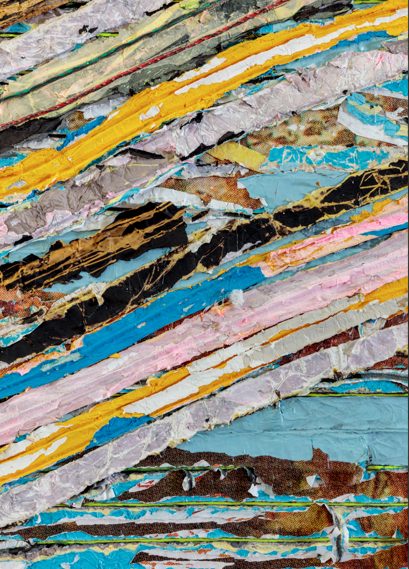
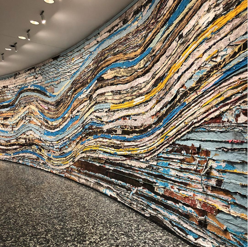
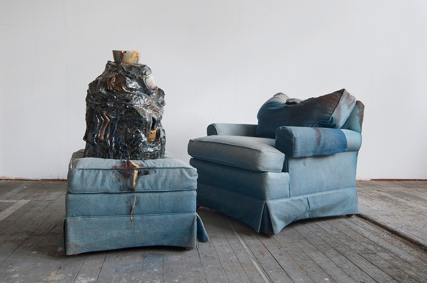
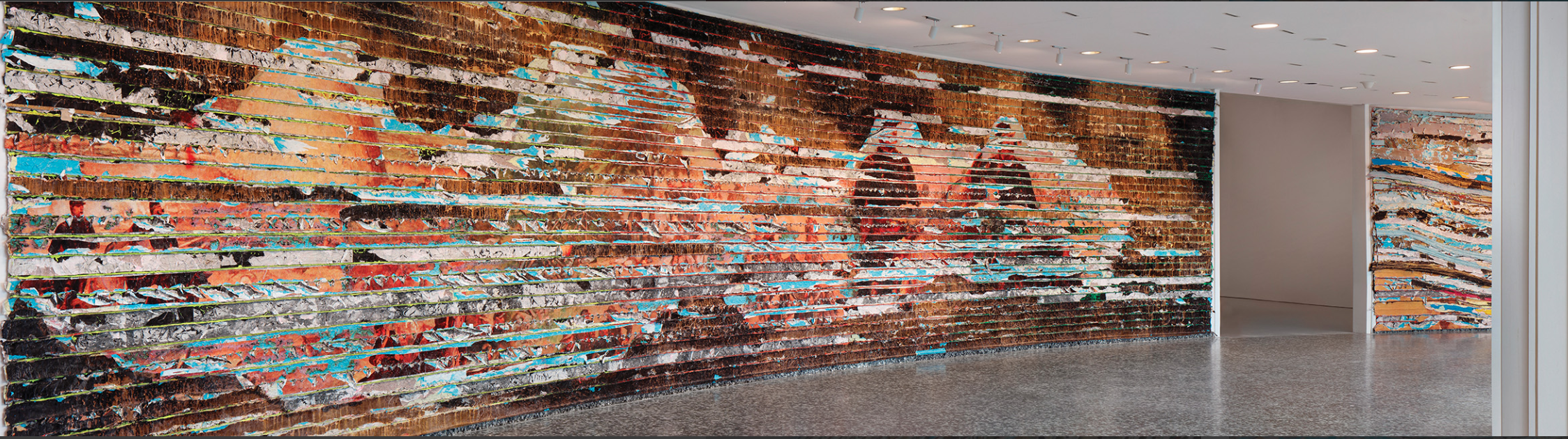
0 Comments

Experience: Hirshhorn

10/30/2019

0 Comments

 
Picture
Picture
I went to WashingtonDC last weekend because my mom had a work thing, so I went to a bunch of art museums. I am going to be reflecting on the Hirshhorn because I saw an exhibit by MarK Bradford there and we learned about him in Art III, also because there were a bunch of high quality pictures of his work online that I can steal since the pictures I took were pretty bad. This exhibit was titled "Pickett's Charge" and had a really cool content/background. I was originally inspired by Paul Philippoteaux's choloroma(which according to google is like a panoramic image of a platform??) of Pickett's charge during the American Civil War. Bradford distorted it to create 8 45ft long paintings which are what I saw.
Picture
Reaction:
​       This is arguably a very messy work of art, which is part of the reason I chose to react to it as opposed to other things I saw. I thought maybe understanding other's motivations to work messily would help inspire Coach Halls goal for me to create "messy" artwork. I really like the way he uses destruction and dis-assemblage to reveal a deeper meaning and texture "lurking beyond the surface." I think destruction of my work after I made it could be a fun way to draw in more content. Like taking an actual knife to the canvas. It's inclusion of ropes and knots intrigues me and reminds me of  a project that I did in eighth grade where I tied rope around two forearms and hands that I made. I really like that repetition and might include it in further works as an added 3D element. Furthermore I was really draw to his color palette. I love the way the warm red tones interact with light blue dispersed everywhere. It is breath taking. But in his more blue pieces, he uses yellow to brightly accent his work. I really like this form of color play, where there are a bunch of similar colors and then one to offset them and create beautiful contrast. 
       I am curious as to how he deals with making art on such a large scale. Does he compartmentalize, focusing on one specific section and then moving or or does he deal with the canvas as a whole all at one time. Since I want to continue to work on a large scale, learning from someone who successfully works on a much larger scale would be beneficial. I am interested in how people usually react to his work. I first came at it from a purely aesthetic viewpoint, since I didn't know the content and thus disregarded it. But can others draw the meaning more easily. That is one of the things I wouldn't give him a hundo on if I were grading it. His content isn't very obvious and it would be challenging for people who have not read his artist statements to understand. So I think I will stick to my overly blunt depiction of self-harm in my work.
​       Overall I really enjoyed this trip and seeing this exhibit. It was wonderful and stunning and think I learned a lot abotu process and its deep involvement in content and the meaning behind a work.
Picture
Picture
Link to video about Mark Bradford and his exhibit at the Hirshhorn: 
​https://www.youtube.com/watch?time_continue=1&v=KvX7bSbQ150
​
I tried to find his website to link it, but the link he has on his facebook's domain is being sold, and I can't find the new address so I cant' link it
0 Comments

Lunchtime Lecture #4: John Freyer

5/12/2019

1 Comment

 
I just want to comment that the last two Lunchtime Lecturers(Sasha Waters Freyer and John Freyer) have the same last name: Freyer. Are they related or is this just a coincidence? 
This I think has been my favorite Lunch Time lecture thus far. I am not really a coffee person, but the motivation behind his coffee cart was really impactful. I admire his ability to take the hardships in his life, push through them, them make art to help people struggling with the same thing as him. Beyond being a cool person with a big heart, he is also quite funny. I was reading up on him and in his All my Life for Sale project he sold his side-burns, which is hilarious. His Social Practice art provides a different way to look at art which I hadn't considered before. I think I would be fun to do, maybe even on a limmited scale for my Head and Heart project.
Picture
Free Hot Coffee
Picture
All my Life for Sale
Picture
Free Ice water
Picture
Free Ice Water
Link to a Youtube video explaining All my Life for Sale on the Conan O'Briaen Show: www.youtube.com/watch?v=PSmCwMRWPMM
​

Also I have no idea how to give a credit line to his work because they are so complex and especially for All My Life for Sale have a huge amount of elements and media. Because of that, I am not going to give them credit lines beyond the name of the project associated with each picture. 
1 Comment

Experience: Try-Me Gallery

5/12/2019

0 Comments

 
Picture
Titus Kaphar, Matriarch Shredded, Oil on canvas, 2009
approximately: 48 x 36 inches (dimensions variable)
Picture
Michelle Erickson, Butterfly Skulls, Porcelain, black porcelain and venetian blue tin glaze, 2014, 7 x 11 inches each.
I really enjoyed this experience and I am immensely envious that these people can afford to own so many amazing works. Lots of the works on display weren't really my cup of tea, but they were impressive nonetheless. From this exhibit, I mostly drew inspiration for my sculpture from Gavin Keyon's Straining at the Leash  and Marc Sijan's Levitation. I really liked the hanging elements and kind of slightly disturbing imagery. I like the elements of weight at play in both of the works and hope to incorporate them into my own work through my noose that will be suspended my my hands and the hopeful lightness my butterflies will give off. 
    I really like the broadness in styles of the work the Royalls have collected. The wide range provides for an interesting and dynamic display in their gallery. I am curious as to how they choose and find artwork to buy. Do they just hear of auctions and go to wherever they are held to buy art, or do they have people monitoring the art markets and buying things for them? This whole process of art collecting at such a large scale really intrigues me.
Picture
Marc Sijan, Levitation, Polyester resin and paint with mixed media, 2013, 75 x 27 x 15 inches
Picture
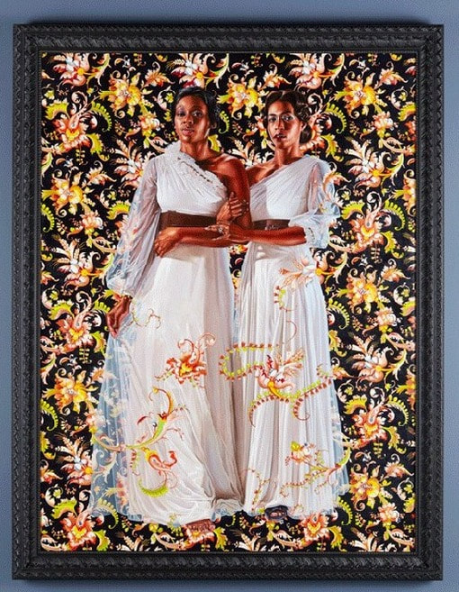
Kehinde Wiley, The Two Sisters, Oil on linen, 2012, 96 x 72 inches
Picture
Gavin Kenyon, Straining at the Leash, Plaster and rope, 2011, 60 x 14 x 29 inches
Picture
Jessica Jackson Hutchins, Every Man has his Tastes, Upholstered chair and ottoman, glazed ceramic, ceramic objects, paint, 2013-14, 75 x 39 x 35 inches
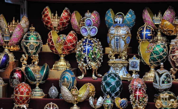
Interesting article that shares more about the owners of Try-Me and their view of the art they own:
richmondmagazine.com/arts-entertainment/collecting-for-the-love-of-it/
0 Comments

Experience: Lunchtime Lecture #3

2/24/2019

2 Comments

 
Picture
On Wednesday the 20th of February,  we had another Lunchtime Lecture and Sasha Waters Freyer. She is the Department Chair of Photography and Film at VCU, and she is a Film maker. I mainly focused on her discussions regrading her short films. They remind me a lot of collages, but with a third detention of time added on. I liked the experimental nature of them and the visuals reminded me of serial killers for some weird reason. If the music was in a higher pitch and slower the clip we were shown could fit in a horror movie. Freyer said she liked to use "the medium of film as plastic artistic medium," akin to painting, especially in its shot structure. So, a self-identified painter, I immediately started to recognize the relationship between the two. They are both very fluid, time consuming art forms that need intense patience, and require so much planning(or winging it as many people[me] tend to do) and preciseness to achieve a certain goal. However, they both have an unrestricted freedom about them, allowing their creators to do whatever they want in order to express themselves. Although I would never try this medium, because I don't have nearly enough patience to work with technology, I appreciate it weirdness, also it seems really expensive, or at least Documentary work is expensive. I feel bad for her that this film making can't be her career and that she has to supplement it with teaching and writing, but I understand that not everyone can do what they love most as a profession, because if that was the case my sister would be a professional sleeper, and my brother would be a professional Fortnite addict. I appreciate the messages that she is trying to portray in her documentaries, giving a voice to outcasts, and people who usually don't get the spotlight, and I generally like her work.

2 Comments

Experience: DC Field-trip

12/12/2018

1 Comment


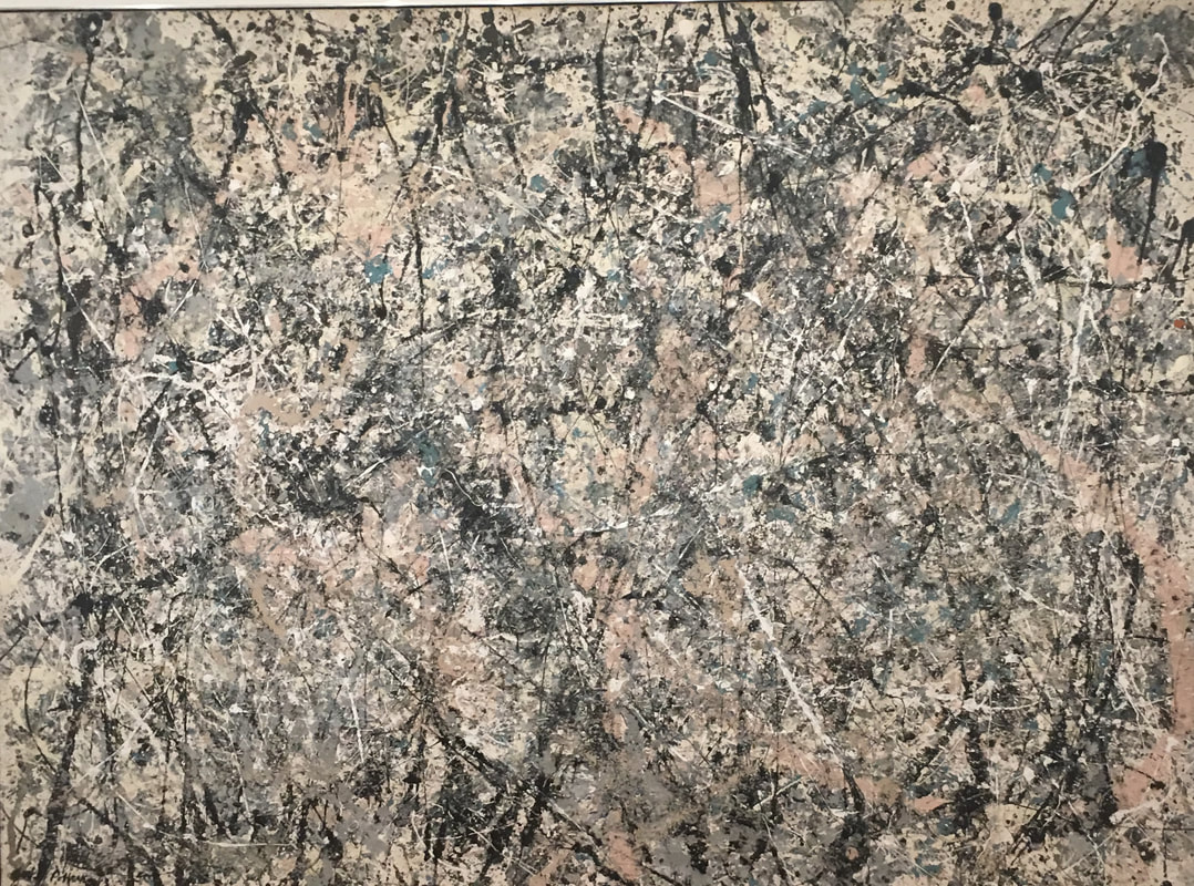
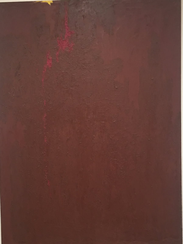
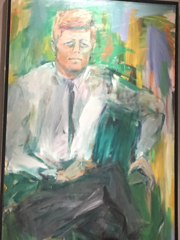
Abstract Expressionism

I don't really like looking at abstract expressionism, or non-objective art, but I didn't completely hate some of the things I saw. I liked the Pollock piece that I saw simply because it brought back childhood memories of reading "Olivia" where she say a Pollock piece and recreated it on her wall. I respect him more than other non-objective artists because his concept of basically 100% splatter painting was pretty unique and hadn't really been done before him. I don't really like Clyfford Still's work though. It just feels to simple to me, and doesn't look like there was a lot of effort put into it. Despite my dislike of his artwork, I am intrigued as to how he created the texture of his artwork. It has lots of little bumps covering it and I can't for the life of my figure out how they were made. The Pollock painting was made with lots of quick rushed motion, with big flings of paint coming from the shoulder. The Still's painting in comparison was made with more careful methodical movements even though they both share a non-objective art style. The de Kooning piece was made with quick brush strokes in the background, but slower and more careful in rendering JFK's face and body. I was really surprised by the size of these works, I think it is because I usually work on a smaller scale, so really anything bigger than that is a surprise to me. I was also surprised by the fact that the presidential portrait of JFK was made by an abstract expressionist artist. All of the other portraits, with the exception of Chuck Close's Bill Clinton, were highly detailed and realistic. I still don't really know what I am going to do for my abstract expressionist painting, but I was thinking of either having a limited color scheme like Still's or just strait out having a giant rainbow as my painting. I am intrigued by the texture of Still's painting, so I also want to mimic it even if I don't entirely know how to. I think the process will be fun at least.
Picture
Jackson Pollock
American(1912-1956)
Number 1, 1950(Lavender Mist)
1950
oil, enamel, and aluminum on canvas
Ailsa Mellon Bruce Fund 1976.37.1
National Gallery of Art, Washington DC
Picture
Clyfford Still
American, 1904-1980
PH-571(1951-N)
1951
oil on canvas
Robert and Jane Meyerhoff Collection
Gift in honor of the 50th Anniversary of the National Gallery of Art 1989.87.1
National Gallery of Art, Washington DC

Picture
Elaine de Kooning
American, 1918-1989
John F. Kennedy(1917-1963)
1963
oil on Canvas
National Portrait Gallery, Washington DC

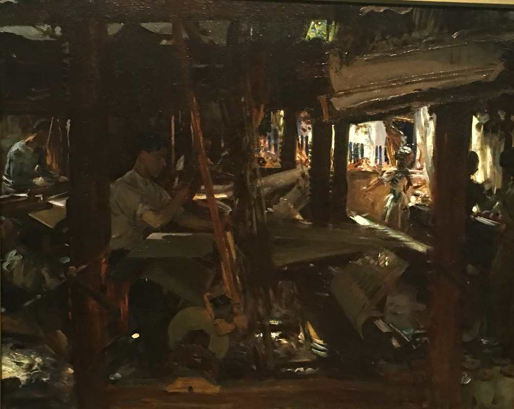
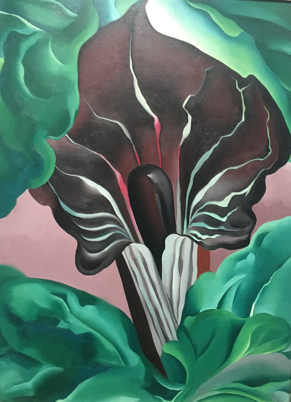
Inspiration for Play Pages

None of these works really relate to what I have been doing in my play pages. I've mostly just been drawing people in a variety of mediums, some of which I don't really ever use and some of which I uses a lot. These just have vibes that I really enjoy. I like the Sargent piece because there is so much in your face that you can't really understand what it going on. I also love the color scheme. I have found that I am drawn to browns and dark colors in general. I am also in love with the texture of this piece. It doesn't really show up well in the photo, but there is a build up of paint in some strokes that I desperately wanted to touch just to experience the piece more. I love the O'Keeffe painting mostly because I am in love with her, and because I think the comments on her artwork looking like vaginas are hilarious(I asked a few gynecologist-I was at a work party for my mom right after the field trip- if they though her work looked like a vagina and they said "sure" so I'm taking that to mean it does). I just love the femininity that it exudes with the soft lines and colors. One my my favorite pieces though, was the Pulse Room by Rafael Lozano-Hemmer. It was beautiful and really calming especially after reading that it is supposed to mimic a scene where a character was in death's cavern. I especially loved how you could hear and feel the pulses. These works make me want to branch out with my artwork more and do things other than painting acrylic portraits, I want to experiment more with sculpture and I want to paint different subjects like flowers, backgrounds, or even light bulbs.
Picture
John Singer Sargent
(1856-1825)
1912
oil on canvas
Gift of Charles Lang Freer
Freer Museum, Washington DC
Picture
Georgia O'Keeffe
American, 1887-1986
Jack-in-the-Pulpit No. 2
1930
oil on canvas
Alfred Stieglitz Collection
National Gallery of Art, Washington DC
Rafael Lozano-Hemmer
Mexican, b. 1967
Pulse Room
2006
Incandescent light bulbs, voltage controllers, heart rate sensor, computer, metal stand, speakers, custom software in Delphi
Courtesy the artist and bitforms gallery
Hirshhorn Museum, Washington DC
1 Comment
<<Previous

    Author

    I am a sleep deprived artist trying to make ends meet. :)

    Categories

    All
    Awareness
    Experience
    Process

    Archives

    April 2021
    March 2021
    February 2021
    January 2021
    December 2020
    November 2020
    October 2020
    September 2020
    August 2020
    July 2020
    June 2020
    May 2020
    April 2020
    March 2020
    February 2020
    January 2020
    December 2019
    November 2019
    October 2019
    August 2019
    July 2019
    June 2019
    May 2019
    April 2019
    March 2019
    February 2019
    January 2019
    December 2018
    November 2018
    October 2018

    RSS Feed

Powered by Create your own unique website with customizable templates.
  • Home
  • Gallery
    • Fantastic Four
  • Blog